Thursday, March 31, 2016

Precious Metals Miners Portfolio - March 2016 Update

The charts below show the Precious Metals Miners Portfolio performance since inception (December 16, 2015):


As the charts show, the portfolio, comprising five stocks (Fresnillo, Claude Resources, Newmarket Gold, Fortuna Silver and Richmont Mines) returned a profit of 66.5% since December 16, 2015. In the same period the broad precious metals miners market, represented by GDX, returned 42.1% while
S&P 500 lost 0.6%.

Let me show the performance of each stock, included in my portfolio:


The leaders were Claude Resources (96.5% up) and Richmont Mines (88.6% up). The worst results were delivered by the heavy-weight silver / gold miner, Fresnillo plc (up 35.3%). 

As I notified my readers on March 7, 2016 - Claude Resources left my portfolio due to being acquired by Silver Standard Resources. Although this deal is not closed as of today, I assume that it will be closed soon. In my opinion, it is not a fair deal for Claude's shareholders. I believe that this stock could go much, much higher without Silver Standard but the Claude's management thinks differently. That is why I sold all Claude's shares on March 7, 2016 at C$1.42 a piece. 

What now? Well, to be honest I had some problems with choosing another company. To remind my readers, the following conditions must be filled if any stock is to be included into my portfolio:
  1. Only producers - My picks do not include any exploring company. Simply put, explorers are riskier than producers, and I want to limit risks as much as possible. What is more, these producers must hold at least two operating mines.
  2. Debt free - Debt is also risky, so my top companies hold either very small debt or even no debt at all.
  3. Low costs of production - My picks are low-cost producers. If I am wrong claiming an incoming end of a bear market in precious metals, low-cost producers should perform relatively better than other PM-related stocks. It means that losses incurred by investors should be relatively low.
  4. Last but not least - Catalysts - Looking for the best stocks, I was trying to find companies with some near-term catalysts defined as a big chance for a relevant increase in production.
So, starting from April 1, 2016 B2 Gold (NYSE: BTG) will replace Claude Resources in my portfolio. This stock was acquired today at US$1.66 a share. 

In a few days I will present my detailed opinion on this company. Today I only want to mention that the second condition (debt - free) is not filled - B2 Gold carries some debt, although, in my opinion, it is not a hard burden. On the other hand, this company is run by an excellent management so the debt risk is much mitigated. 

Lastly, the chart below summarizes the results delivered by the portfolio on a monthly basis:


Wednesday, March 30, 2016

In 2016 Banro Corp May Deliver Weaker Results Than In 2015

My first (and last) article on Banro Corp, published on Seeking Alpha, triggered quite a violent discussion. Some people accused me of a biased attitude against the company. Of course these people were totally wrong - when presenting any opinion on anything I am trying to be as much objective as possible. No company, website, person etc. pays me for my opinions - I am an independent analyst. Period.

In this article I am discussing the 2015 results delivered by Banro Corp. The article is structured around two main topics: positives and negatives. I encourage my readers to assess on their own, which features overweight.
Namoya

Positive

In January 2016 Banro declared commercial production at Namoya, the second operating mine. Therefore, starting from the beginning of 2016, the company will be reporting Namoya's results in its statements of operations; until the end of 2015 all costs and revenues, delivered through selling gold produced at Namoya, were capitalized into the company's balance sheet in the line called "Mine Under Construction". Let me discuss this issue a little bit deeper.

At the end of 2014 the line "Mine Under Construction" was showing the cost of $414,258 thousand - see the picture below (page 27 of the Annual Report):


At the end of 2015, $388,012 thousand was disclosed as the cost - please, note that "Pre-commercial production revenue" of $53,318 thousand was accounted for as an item decreasing the total cost. Since the beginning of 2016 all revenues generated by Namoya will be accounted for as revenue in the statement of operations but until the end of 2015 the company could not book this revenue, due to accounting rules, as operating revenue. Consistently, all costs attributable to Namoya in 2015 were shown in the same way (i.e. in the line "Mine Under Construction". 
In other words, in 2015 all revenues and costs, visible in the statement of operations, were attributable to the Twangiza mine, only. In 2016 both mines, Twangiza and Namoya, will be shown in this statement. Why am I writing that? Because, due to these rules, the investors have been not able to find out what costs of production the company has to incur to extract gold at Namoya.

Negative

This is a negative. If I do not know these costs  I am not able to asses whether Namoya is going to be profitable in the future or it is not. Simply put - there is no data on that issue. 

However, I may try to do it indirectly. 

First of all, in 2015 the company processed (milled) 1,416,179 tons of ore at Namoya. The average head grade was 1.88 grams of gold per ton of ore and the company was recovering gold at the rate of 84%. Therefore one ton of ore processed was containing gold of market value of  $58.7 (1.88 gram x 84% x gold price realized ($1,157 per ounce in 2015) x 0.03215 (grams to troy ounces)). 

Now, production costs. The table below shows production costs reported in the Namoya Technical Report, published in 2013 (page 127):


Summarizing these items:

  • Mining costs: $8.32 / ton
  • Processing costs: $15.01 / ton
  • General and Administrative: $14.05 / ton
  • Selling costs: $32.53 / ton
  • Minus Government Royalty (which is included in the net gold price realized)
  • Total: $58.28 / ton

Well, it seems that, using the 2015 gold prices, Namoya is going to be slightly profitable because the difference between revenue and costs is standing at $0.42 per ton of ore milled and sold. 

Assuming the price of gold at today's level of $1,233 per ounce, the difference would be a little bit higher ($4.32 per ton). 

I realize that production costs presented above should be updated, but 3 years after the publication of the last Technical Report these costs might be even higher. 

On the other hand, the company assumes that in the fourth year of operations the total cost of production should stand at $54.73 per ton. If such is a case (i.e. due to the learning curve effect, costs should go down), Namoya could be profitable even at the price of gold of $1,157 per ounce. 

Summarizing - it seems that the results reported in the first quarter of 2016 may surprise many investors quite negatively. If gold prices are standing at today's level of $1,233 per ounce, in the first quarter of 2016 Namoya should deliver the margin of around $3,500 thousand (margin is defined as revenue less operating expenses without depreciation and depletion), which is a rather meaningless figure (for example, the quarterly margin, delivered by Twangiza, was $15,790 thousand in 4Q 2015).  

Twangiza

Positive

Twangiza is, in my opinion, a much better operation than Namoya. Let me discuss the mine's economics. The table below presents the Twangiza basic operating and economic measures, actual for 2014, 2015 and forecasted for 2016: 


As the table shows, Twangiza is a highly profitable operation. In 2015 this mine delivered gross margin of $81,306 thousand or, using other metric, it delivered percentage margin of 52%. Assuming the price of gold of $1,230 per ounce in 2016, Twangiza should deliver gross margin of $80,667 thousand (a little bit less than in 2015 because of lower throughput). 


2016 Forecast

Let me summarize the above calculations and present my 2016 forecast for Banro (Twangiza production: 120,000 ounces; Namoya production: 110 thousand ounces of gold). The table below shows all figures:


"Corrections" of $20,618 thousand comprise the effects of many gold forward agreements signed by Banro in 2015. According to these agreements, the company is obliged to deliver specific amounts of gold, produced at Namoya and Twangiza, sold at strictly defined gold prices. In other words, through these agreements the company is selling part of its gold production below market prices - that is why the corrections negatively impact the company's results.

The last line depicts the adjusted EBITDA, calculated for 2014, 2015 and 2016. Due to issues described in this article, in my opinion, despite putting into operation a new mine, in 2016 Banro should report worse results than in 2015. 


Tuesday, March 29, 2016

The Widening Spread Between Junk Bonds And 10-Year Treasuries Signals A Drop In Stock Prices

A couple of weeks ago I presented a thesis that the spread between junk bonds and US treasuries widens when something wrong is in the  making. This metric has proved to be particularly effective when the long-term perspective is considered. 

However, in the short-term this metric is also of some value - please, look at the chart below:


                             source: www.stockcharts.com 

The chart shows that every time the spread between junk bond and 10-year treasuries starts to widen (the downtrend is renewed) the broad equity market, represented by S&P 500, follows it (starts to go down a little bit later).

Since mid-March the spread has been widening so, if my thesis is correct, the broad equity market should start its leg-down soon.

Another thing - as the chart below shows, the last S&P 500 strong increase was made at decreasing volume (yellow area):


                        source: Simple Digressions

Since the middle of February 2016 the index went up 12% but the average daily volume went down from 3.5 billion shares to 2.3 billion shares (a decrease of 34%). It is by no means a bullish pattern...


Monday, March 28, 2016

Impact Silver - Decent Results in 2015 But The Future Is A Question Mark

Summary:

  1. Impact Silver, contrary to its peers, does not report the updated mineral resource estimates - therefore it is a hard task to present any opinion on the company's potential
  2. In 2015 the company delivered quite good operating and financial results - however, despite mining the high grade ores, the company was not able to substantially increase its revenue per ton sold, expressed in Canadian dollars
  3. In my opinion, Impact Silver's results are highly leveraged to silver prices - I would even say, they are leveraged too much.

It is a problem to analyze Impact Silver. As I stated before, the company does not deliver the up-dated mineral resource estimates (the only exception is the last estimate of mineral resources, prepared for the New Capire deposit - currently put on care and maintenance). If I cannot find the details on the size and quality of a company's mineral base, I am not able to assess whether such a company has any potential. Impact Silver is a such a case. Therefore in this article I am trying to cover the current developments with no attempt to answer a question how these developments may affect the company in the future.

First of all, I think that  the company's current philosophy is to mine as highest grade ores as possible. If such a strategy is applied the question of high grading arises.

Without going into details, "high grading" means that a company is trying to increase its operating cash flow through mining the ores of the highest grades as possible. Therefore, during hard times, when silver prices are relatively low, Impact Silver is able to generate positive cash flow. In other words, high grades mean more silver extracted from a ton of ore, which, when combined with the strict cost control system, results in higher cash flows. However, a deposit, depleted of the high grade ore during hard times, may be uneconomic in the future (the ore left may be of much lower grade than that required for the profitable mining).

Is Impact Silver such a case? I do not have any idea because, as I noted above, the company does not deliver the updated estimates of its mineral resources. So let me leave this problem open for additional digressions in the future.

Below I am summarizing the 2015 developments, reported by the company.

Firstly, in 2015 Silver Impact produced the highest amount of silver in its history:


As the chart shows, the company delivered 950,059 ounces of silver, 30.9% up, compared to 2014.

What is more, the company was able to minimize the gap between its production costs and revenue:


It is an interesting chart. It shows that Impact Silver was able to decrease its accounting costs of production from $105.92 in 2013 to C$94.63 per ton of ore sold in 2015 (a decrease of 11.9%).

Unfortunately, the revenue delivered through selling one ton of ore was, more or less, the same in 2013, 2014 and 2015. Why am I writing "unfortunately"? Well, the average price of silver, expressed in Canadian dollars, went slightly up from C$1,449 in 2013 to C$1,481 per ounce in 2015 (an increase of 2.2%). It looks like that despite high grade ores mined by the company in 2015 (look at the chart below), it was only able to maintain its revenue per ton sold at a relatively unchanged level of C$84.96 per ton, compared to 2013 and 2014.


Well, in my opinion, the company has no moat. If silver prices do not go up in the coming future, Impact Silver is condemned to report results not better (if any) than those presented in the table below (2015):


Indirectly, my opinion seems to be supported by the behavior of Sprott Asset Management - one of the largest shareholders of Impact Silver. The chart below shows that this important precious metals asset manager started to sell the company's shares since late 2015:


According to the last announcement (February 10, 2016), on January 29, 2016 Sprott Asset Management held 6,292,500 shares of Impact Silver (8.6% of fully diluted shares).


                                             source: Impact Silver presentation (page 21)


Friday, March 25, 2016

Despite Gold Prices Correction, Investors In The West Are Still Accumulating It

Gold prices are going down, at last:


source: www.stockcharts.com

Since their record high, printed in the beginning of March, gold prices retreated around 6%. However the investors are still accumulating this metal.
Please, look at the chart showing the weekly inflows / outflows of gold, reported by the GLD SPDR Gold Trust:


                 source: SPDR Gold Trust Shares and Simple Digressions

Although the weekly inflows are much lower than those reported in February and in the beginning of March, this ETF is still adding gold into its vaults. In my opinion, it is a bullish pattern.

Wednesday, March 23, 2016

Share-based Payments - Be Careful When Studying Financial Reports

Investors studying financial statements of tech companies should pay close attention to some distorting accounting issues. In my opinion, one of such issues are the so-called "Share-based payments". Let me take Twitter as an example.

Below you will find an excerpt from the last Twitter's cash flow statement (page 67):


Please, look at the last line "Net cash provided by operating activities". It seems there is significant progress in the company's performance - Twitter has been able to generate positive and higher cash flows year over year, starting from 2013.

However, the things do not look as bright as somebody could expect. The fifth row entails "Share-based compensation expense". Because it is a non-cash issue (instead of cash payments the company issues stocks), it must be subtracted from other costs resulting in higher cash flow from operations.

However, share-based payments are definitely costs, in fact. The only difference is that these costs are not incured by the company directly but indirectly, by the company's shareholders.

My point of view is such - if the company was to pay the salaries (because share-based payments are a kind of salaries) in cash instead of payments made in shares, then its cash costs would be much higher than those reported in the cash flow statement.

Using other wording, share-based payments are hidden salaries. While many companies use this form of compensation for work, the tech companies are the leaders in using this method. Simply put, they exaggerate.

I have re-calculated Twitter's statement of cash flow from operations to show how this statement would have looked like if share-based payments were paid in cash:


Well, now it looks totally different. Instead of generating positive cash flows, Twitter would have reported negative ones.

Be careful when studying financial statements.


Tuesday, March 22, 2016

Newmarket Gold - Here Is The Strength Of This Gold Miner

Yesterday Newmarket Gold published an update to its mineral resources. Some of the readers of this blog were interested in the company's mineral resources so it is a good moment to look at this issue a little bit closer.

The most important mine in Newmarket Gold's portfolio is Fosterville, located in Victoria, Australia. That is why I am discussing this particular deposit.

The table below shows the Fosterville mineral base, as of the end of 2015:


                                                            source: Newmarket Gold

For those unfamiliar with such tables - please, look mainly at the rows titled "Fosterville Underground" because it is that part of the mineral base, which is / will be currently / in the future mined.

As the table shows, the economically viable part of the mineral base, reserves, amounts to 244 thousand ounces of gold.

Another thing - due to the succesfull 2015 exploration program, the company added 62 thousand ounces of gold to the Fosterville reserves, compared to the end of 2014.  Well, let me stop at this point because it is a littly bit tricky issue.
As a matter of fact, the company added much more ounces of gold because in 2015 as many as 123,095 ounces of gold were produced at Fosterville. To complicate the matter further, the amount of gold produced at a mine is not equal to the amount of gold mined. Why? Here is why - in 2015 the company mined 704,211 tons of ore at Fosterville. This ore was grading 6.11 grams per ton so it means that the company mined 704,211 x 6.11 = 4,302,729 grams of gold. This amount is equal to 138,338 ounces of gold. Then this gold was processed at the Fosterville processing facility (mill) resulting in 123,095 ounces of gold finally produced (the amount of gold produced is lower than the amount of gold mined because part of the gold is lost, mainly due to chemical processing) . However, the amount of gold depleted was standing at 138,338 ounces (it is an amount, which should be subtracted from the reserves reported at the beginning of the year).

Now, the best thing - because the reserves at the end of 2015 are higher than reserves at the end of 2014 (by 62,000 ounces),after adding to that figure 138,338 ounces of gold depleted, I get 200,338 ounces of gold. It is the amount added to the mineral base due to the succesfull exploration program. In my opinion it is quite an impressive figure.

What is more, the company adds new ounces of gold every ear, starting from 2013:


The third row, titled "reserves added through exploration" depicts the effectivness of the company's geologicial team. It seems that these guys aim at keeping the Fosterville reserves stable at around 350 thousand ounces of gold, which is enough for  3 years of mining. In my opinion, it is the greatest strength of Newmarket Gold.


Monday, March 21, 2016

Demand For Physical Gold Is Back (From The West)

China accounts for a large stake in world demand for gold. What is more, the Chinese people are mainly interested in investing in physical gold, contrary to the West where investors are very busy in speculating in gold futures contracts.

The chart below shows the withdrawals of gold reported by the Shanghai Gold Exchange, starting from 2008 (red bars). Apart from withdrawal numbers I have plotted also the world gold production (yellow bars). All figures are presented in tons of gold:


source: World Gold Council and www.bullionstar.com

* - only the January and February data

As the chart shows, China was very eager to absorb a vast amount of world's gold production, particularly since 2013. Let me present this phenomenon at another chart:

Here, I plotted a percentage share in demand for gold, attributed to China (represented by SGE - the Shanghai Gold Exchange). It is easily seen that since 2013 the Chinese have been absorbing around 60% - 80% of world's gold production.

Next thing, although this year (January and February) the Chinese demand has been a little bit weaker than before (probably due to higher prices of gold), China has absorbed 67% of  world's gold production to date (still an impressive figure).

Quite interestingly, this year the Chineses demand is strongly supported by the gold inflows to one of the biggest gold ETFs, SPDR Gold Shares (NYSE Arca: GLD):


Year to date the fund reported an inflow of as many as 176.7 tons of gold. In my opinion, it is a vast amount of gold - for example, in 2014 and 2015 the fund reported an outflow of 155.9 tons of gold so in just 2.5 months of 2016 the gold inflows were higher than the 2014 and 2015 outflows, combined.

So the Western demand on gold is back. What is more, the combined demand on gold, demonstrated by China and GLD this year, accounts for around 89% of gold production. In other words, during the first two months of 2016 China and GLD absorbed 89% of gold produced worldwide! This data does not take into account such countries as India or Russia, which are also active players accumulating physical gold.

Summarizing - it looks like the strong demand on gold is back.


Sunday, March 20, 2016

A Quick Way To Find Out Whether A Company Is Able To Pay Dividends

Many investors look for dividends. In this post I am showing how to find out whether a dividend paid by a company is sustainable in the long-term.

Let me start from a gold / silver miner, called Gold Resource Corp. (NYSE MKT: GORO). I have discussed this company in one of my articles - here is a link. Most recently this company has cut its dividend. I think this move was highly predictable.

First of all, the company has been paying dividends since 2010:


 As the chart shows, between 2010 and 2012 the company was increasing its dividends. Then, after 2012, when a medium - term bear market in gold started, GORO started cutting its dividends. Well, quite a reasonable move. However, look at the chart below:


In my opinion, this chart is the best prove that GORO should not have been paying any dividends, even during good times. The chart shows a measure constructed in the following way:


cash flow from operations - cash flow from investing activities - dividends paid

All figures are taken from Statement of Cash Flow. Simply put, the figures calculated in the above presented way for each financial year (or quarter) show whether paying dividends by GORO was a right policy. It looks like it was not. In most financial years (those in red) the company was paying dividends despite the fact that it should not have done it.

In other words - for example in 2013 the company generated $6.87 million in cash flow from its (mining) operations. This cash was spent on investment of $6.67 million so the balance between cash delivered from operations and cash spent on investment was around zero (plus $0.2 million). A prudent company would not pay any dividends in 2013 but GORO did it - the company paid $25.5 million in annual dividend. I understand that the company's point of  view was that this high dividend was paid  because in 2012 GORO earned a lot of money (net profit of $33.67 million and $31,14 million in cash flow from operations). However, GORO is taking decision on paying dividends each month so in some point of 2013 the company's management should have made a decision to stop paying dividends. Unfortunately, they only cut it.

In December 2015 GORO declared that:
"The Company is modifying its instituted monthly dividend from one cent per share per month to 1/6 of a cent per share per month (or two cents per share per year) beginning with this December dividend."

Well, there are no miracles when a companys' economics is concerned - if a company is not able to pay dividend it will surely stop paying it at some point in the future. I think that cutting GORO's dividend to 1/6 of a cent per share per month means that the company have practically stopped paying it.

Other examples.

Intel (NASDAQ: INTC) - the company is regularly paying dividends. Let me check how this company looks when my financial measure is applied:


As the chart shows, since 2008 Intel has been definitely able to pay dividends. Only in 2013, when the company made substantial investments, the balance was negative. But this was a one-off event, with no material impact on Intel's ability to pay dividends.

Summing up - Intel could even increase its dividend because the company demonstrates a large buffer to do it (around $6 billion a year). On the other hand, Intel de facto does it - the company is buying its shares back from its shareholders.

Williams Companies. 

Williams (NYSE: WMB) is a provider of large-scale natural gas infrastructure in North America. It is a very interesting business but, in my opinion, Williams' dividend policy is a total mistake:


As the chart shows, the company has been paying dividends although from a financial point of view it should not have done it. I guess that Williams is trying to be a growing company (it invests vast amounts of money each year to expand its business) and, simultaneously, an income company, which pays decent dividends. I believe it is a wrong attitude - the company cannot afford to pay dividends and grow its business in such a dramatic way as it has been doing. The negative effect is visible now:


As the chart shows, the company carries too much debt. A "Net Debt / EBITDA" multiple is standing at around 7, which is a very high reading. Prudent bankers would not lend any money to a company holding such a high ratio. What is more, investors share my opinion on Williams and sell its shares, despite a high dividend ratio (14.1%):


Thursday, March 17, 2016

Are We Experiencing A Bull Market In Gold?

I guess many market observers are troubled by the last developments in gold market. After quite a dramatic increase in gold prices many players were expecting a correction or even a return of a bear market. However, at least for the time being, gold stubbornly does not want to go down. Does it mean that the end of a bear market in gold should be announced? Let me discuss this matter.

Firstly, please look at the chart below:


The chart shows that a full-blown bull market in gold is indicated by the decreasing gold / silver ratio (which means that gold was relatively stronger than silver). While this multiple is not a good indicator in identifying the beginning of a bull market, during its full-blown phase this ratio is definitely going down (look at the areas in yellow). 

Since middle 2011 the gold / silver ratio has been trending up, which was an indication of a full-blown bear market in precious metals sector.  

Now, look at another chart. This time the chart shows the action of big speculators in gold futures (COT Report), starting from 2005:


In the upper part of the chart you can spot four areas in yellow, blue, red and green colors:
  • The yellow color shows a period of a full-blown bull market in gold - speculators were holding larger and larger long positions in gold
  • The blue area indicates a period when a bull market in gold was fading - speculators, despite gold prices going higher, were not willing to take more risk and their long positions were not going up or even started to go down
  • The red color indicates a bear market in gold - speculators were unloading their long positions in gold futures 
  • The green color is a period of a fading bear market - speculators seem to be accumulating gold (their long positions sometimes go up, sometimes go down) 
Summarizing - now we are in the green cycle. In my opinion it is a tricky period - a full-blown bull market has not started yet but there are many indications that there is a chance that a bear market is exhausted or even finished.

What is more, although currently the so-called Managed Money (another term for big speculators, as, for example, hedge funds) holds one of the largest net long position (127,427 contracts) in the history of the current bear market, it does not necessarily mean that a large correction is coming. Note that the current high readings relate to the bear market in gold. During a bull market phase Managed Money was holding much bigger net long positions (around 240,000 contracts): 


Wednesday, March 16, 2016

Soybeans - Bullish Supply - Demand Development

Similarly to other agri commodities, soybeans are in their long-term downward trend. On the other hand, in the medium-term (since August 2015) soybeans are trading in a narrow range:


                                      source: www.stockcharts.com

Are there any catalysts which could move the price of soybeans out of this range (up or down)? I think there are.

First of all, deflation, the biggest threat to financial markets, may definitely lower soybeans prices. On the other hand, in my opinion, there are some fundamental developments in supply-demand equilibrium which may drive soybean prices up. Let me discuss this issue.

Firstly - demand and supply.

                                                                                 Supply

The chart below depicts world supply of soybeans, starting from the season 2009 / 2010:


                            source: United States Department of Agriculture and Simple Digressions

As the chart shows, supply was growing at the rate of 3.54% per year.

Now, demand:


                     source: United States Department of Agriculture and Simple Digressions


This time it is clear that world consumption of soybeans was growing at a faster rate than supply (4.78% per year vs. 3.54%).

Why demand is growing faster than demand? Here is an answer:


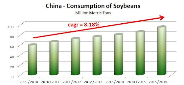
                         source: United States Department of Agriculture and Simple Digressions

I guess it is no wonder that China fuels the world demand for soybeans - this country has been a traditional consumer of soybeans. So, in the long-term, soybean prices should be definitely supported by China's consumption.

However, the devil is in details. In the short - term the play between demand and supply forces varies from one season to another. Please, look at the charts below:


                   source: United States Department of Agriculture and Simple Digressions

As the chart shows, between 2011/2012 and 2014/2015 production was going up faster than consumption. As a result, soybean prices went down from $17.9 per bushel in 2012 to $8.5 in 2015.

On the other hand, between 2009/2010 and 2011/2012 consumption was growing faster than production and prices went up from $8.5 in 2009 to $17.9 per bushel in 2012. So, in the medium-term the best indicator to look at was the difference between supply and demand.

Another indicator is presented below - this time it is "Ending Stocks measured in days of consumption":

             source: United States Department of Agriculture and Simple Digressions


As both charts show, today we see consumption going up faster than supply - it should be perceived as a chance for a trend reversal in soybean prices. This development is also supported by the pattern visible on the futures market:


source: US Commodity Futures Trading Commission and Simple Digressions


The chart shows that currently the big speculators are holding large short positions in soybean futures contracts. Usually it means that we are close to the bottom in prices. Another confirmation:

urce: US Commodity Futures Trading Commission and Simple Digressions


The chart shows that smaller number of speculators wants to go short soybeans. It is also supportive for the price bottom.

Summing up - despite of incoming deflation it seems that bullish market forces are trying to gain control over soybeans. However, before taking any position, traders should closely track the current technical pattern, i.e. the trading range. If soybean prices are able to break above their resistance at around $9.2 per bushel then my thesis will start to be supported by the market action.

Monday, March 14, 2016

Deflation Is Coming


In my previous post I was dealing with investment policy of Fairfax Financial Holdings, a Canadian company run by Prem Watsa. Today I want to show an interesting long-term chart, which demonstrates what Mr. Watsa is betting on. Please, look at the chart below:


                                                        source: www.stockcharts.com

The large chart shows the spread between TIP (10-year inflation adjusted bond) and 10-year treasuries. As the chart shows, since 2014 this spread has been in its downtrend. It is something similar to developments, which started in 2005 and were a prologue to the last financial crisis.

Let me cite Mr. Watsa (page 17):

"Early in 2016, ten-year TIP spreads (i.e., the spread between ten-year inflation adjusted bonds and treasuries) have made new lows, second only to the 2008/2009 lows. Declining TIP spreads,  reflecting lower inflation expectations and higher volatility, result in higher prices for our CPI-linked  derivative contracts."

It looks like the history is going to repeat...


Sunday, March 13, 2016

Fairfax Financial Holdings Ltd - Prem Watsa Still Sees Substantial Risks

Fairfax Financial Holdings Ltd is a Canadian insurance company. It is run by Prem Watsa, who, due to its investment style,  is regarded as the Canadian Warren Buffett. In this article I am dealing with Watsa's investment policy - apart from his spectacular investments (as, for example, Blackberry), Mr. Watsa also applies an aggressive hedging strategy. 

Investment results

Let me start from an excerpt from Fairfax summary of 2015 results (page 2):


The statement above shows Fairfax investment results and gains / losses made on the company's hedges.  It is clear that in 2015 the company made a net loss of $259.2 on its investment portfolio. This loss was a combined result of:
  • $425.0 million: loss on equities (mainly due to a drop in share prices)
  • $501.8 million: profit on hedges
  • $468.7: loss on bonds (mainly due to a drop in bond prices)
  • $35.7 million: profit on CPI-linked derivatives
  • $97 million: profit made mainly on foreign currency
Of these issues, the most interesting are the first two and CPI-linked derivatives. These issues are classics of Watsa's investment style.

Equity portfolio

In 2015 a majority of world's equity indices were flat of slightly below the 2014 levels. As a result, Fairfax equity portfolio fell in value (a loss of $425 million). However, the hedges, applied by Fairfax, were highly profitable - the company made $501.8 million. As a result, Fairfax made a profit of $76.8 million on its equity portfolio. 

The charts below show the results generated by the equity portfolio and financial hedges. Finally, the third chart shows the overall results, starting from 2009:


Financial exposure

Another thing, at the end of 2015 Fairfax was holding a small long position in equities (equities plus hedges). The company had $6.7 billion in equities but this large position was hedged by a mix of financial hedges of notional value of $5.9 billion. Hence I can say that Fairfax net position in equities was long of $0.8 billion. 

It is quite interesting to see Fairfax equity position in historical context:


As the chart shows, at the end of  2009 Prem Watsa was very optimistic on world's stock markets - his company was holding a large long position in equities and had no hedges. 

However, in 2011 Mr. Watsa changed his mind and between 2011 and 2013 Fairfax equity portfolio was nearly perfectly hedged against the stock market fall. At the end of 2014 and 2015 Fairfax was once again net long - but its exposure to the stock market risk was relatively low.


CPI-linked derivatives

Does it mean that Prem Watsa is optimistic on the world economy? Nothing could be further from the truth. Before the last financial crisis Prem Watsa made a huge bet on a major stock market and U.S. residential mortgage-backed securities breakdown. 
This time, since 2010, Fairfax has been betting on a world deflation. The company bets a vast amount of money on that theme:


As the chart shows, at the end of 2015 Fairfax was holding a $100 billion bet on the world's deflation (yes, there is no mistake - $100 billion US dollars!). 

How does this bet work? Let me cite Mr. Watsa:

“Say the consumer price index in the U.S. was 100 when we purchased this contract. In ten years’ time, if the CPI index is above 100 because of cumulative inflation, then our contract is worthless. On the other hand, if the index is below 100 because of cumulative deflation, then the contract will have value based on how much deflation we have had. If, for instance, the index is at 95 because of a cumulative 5% deflation over 10 years, the contract at expiry would be worth 5% of the notional value of the contract. That’s how it works!”

Is it a risky bet? Well, the company risks only the money spent on entering this bet, i.e. around $656 million. I think it is huge amount of money but Fairfax is going to easily survive even if all this money is lost.  

On the other hand, if Mr. Watsa is right, Fairfax can make a killing. Let me cite Watsa again:

“If, for instance, the index is at 95 because of a cumulative 5% deflation over 6.7 years (the average life of derivative contracts), the contracts at expiry would be worth 5% of their notional value”

And the notional value is around $109 billion - please look at an excerpt below:


Next thing - although the average life of CPI-linked derivatives is 6.6 years (please, look at an excerpt above), it seems that the bet is starting to work for the company. After three years of losses (2011 - 2013), in 2014 and 2015 Fairfax made a profit of $17.7 million and $35.7 on CPI-linked derivatives, respectively:


Summary

Fairfax is still betting on a downturn in the world's economy. Although the company is more or less neutral as its equity portfolio is concerned, it bets a huge amount of money on the world's deflation. 


Friday, March 11, 2016

Newmarket Gold - Additional Comments

This article is a continuation of the yesterday published post on Newmarket Gold.

Impairments

Although in 2015 Newmarket Gold made higher profit from mining operations ($60.6 million versus $41.3 million in 2014), the company printed a net loss of $2.8 million (in 2014 Newmarket made net income of $20.0). Let me comment on this issue.

In its 2015 report the company stated (page 25):

"At December 31, 2015, the discounted cash flows over the life of mine for Cosmo was below the carrying value of the long-lived assets of the mine and as a result an impairment of $24,073 was recorded against mine properties and $1,424 recorded against property, plant, and equipment (Note 16), resulting in a total impairment charged to the statement of operations of $25,497"

This impairment charge accounted for the largest part of the total impairment charges, recognized in 2015 ($26,499 thousand in total). In 2014 the company did not recognize any impairment charges. Quite contrary, Newmarket recovered $8,359 thousand from impairment charges recognized in earlier periods. So the results reported in 2015 were worsened by $34,858 thousand, when compared to 2014. In other words, the accounting rules "artificially" lowered 2015 results by $34.9 million. It means that, on a comparable basis, Newmarket would have made a net profit of $32.1 million in 2015 (61% higher than in 2014).

I am writing "artificial loss". Well, I do not claim that accounting rules are worth nothing. Quite contrary. They are very useful because the investors know the actual financial situation of a company.

However, in the gold mining industry a majority of impairment charges are applied when gold prices are much lower than in previous years. With lower gold prices the value of a gold deposit is lower in the long - term. Why? Because there are less ounces of gold which are economically viable. And less ounces of gold means lower revenue in the future and lower value of a deposit.
However, if the prices of gold go higher, the previously recognized impairments will be reversed. So be cautious with impairments - it is a very useful tool but, as any tool, it has to be applied thoughtfully.

Next thing - Newmarket Gold applies very conservative assumptions when determining the recoverable amount of its mines. Let me cite the company, once again:

"For the determination of the impairment, a gold price estimate of A$1,550 per ounce was used for 2016 through 2018, and A$1,500 for 2019 and beyond, taking into account the impact of the Australian dollar exchange rate on the US dollar and using an average Australian dollar foreign exchange rate of $0.75 over the period. A discount rate of 12.5% was used to present value the estimated future cash flows from the operation"

Today A$1,550 is equivalent to US$1,172. It means that the company assumes the medium-term price of gold of $1,172 per ounce, while today gold is trading at $1,250 per ounce (6.6% higher). It means that there is quite a high probability that the company's gold price assumption may be deeply underestimated.

The same thing is with the discount rate of 12.5% - in most cases a rate in the range of 5% - 10% is applied. A discount rate which is higher than usually means underestimation of the impairment charge.
Summing up - while, in my opinion, it is reasonable to use conservative assumptions when calculating recoverable values, the investors should understand how these impairments are calculated.
In the case of Newmarket Gold investors should keep in their minds that impairments charged by the company may be deeply overstated.

Mineral Reserves

There are no current estimates of Newmarket Gold mineral resources / reserves. The last estimates were reported at the end of 2014. According to these estimates:


As the table shows, the company reported relatively low mineral reserves. I remind to my readers that currently Newmarket has three active mines: Fosterville, Cosmo and Stawell. The chart shows that all these mines had 637 thousand ounces of gold classified as mineral reserves. It was equivalent to only three years of mining.
However the strength of this company lies in its resources and the ability to convert resources to reserves. The table below shows mineral resources held by Newmarket Gold at the end of 2014:

Again, at the end of 2014 Fosterville, Cosmo and Stawell were holding mineral resources of 2,932 thousand ounces of gold, which was equivalent to 13 year of mining. The problem is that resources are not that part of a mineral deposit, which is economically viable. To be economically viable, resources must be converted into reserves. To do it, the company must invest, for example in additional drilling, In 2015 Newmarket Gold spent around $12 million on exploration and $42.9 million on development of its properties. I believe that the company will publish an update to its mineral base estimates very soon.